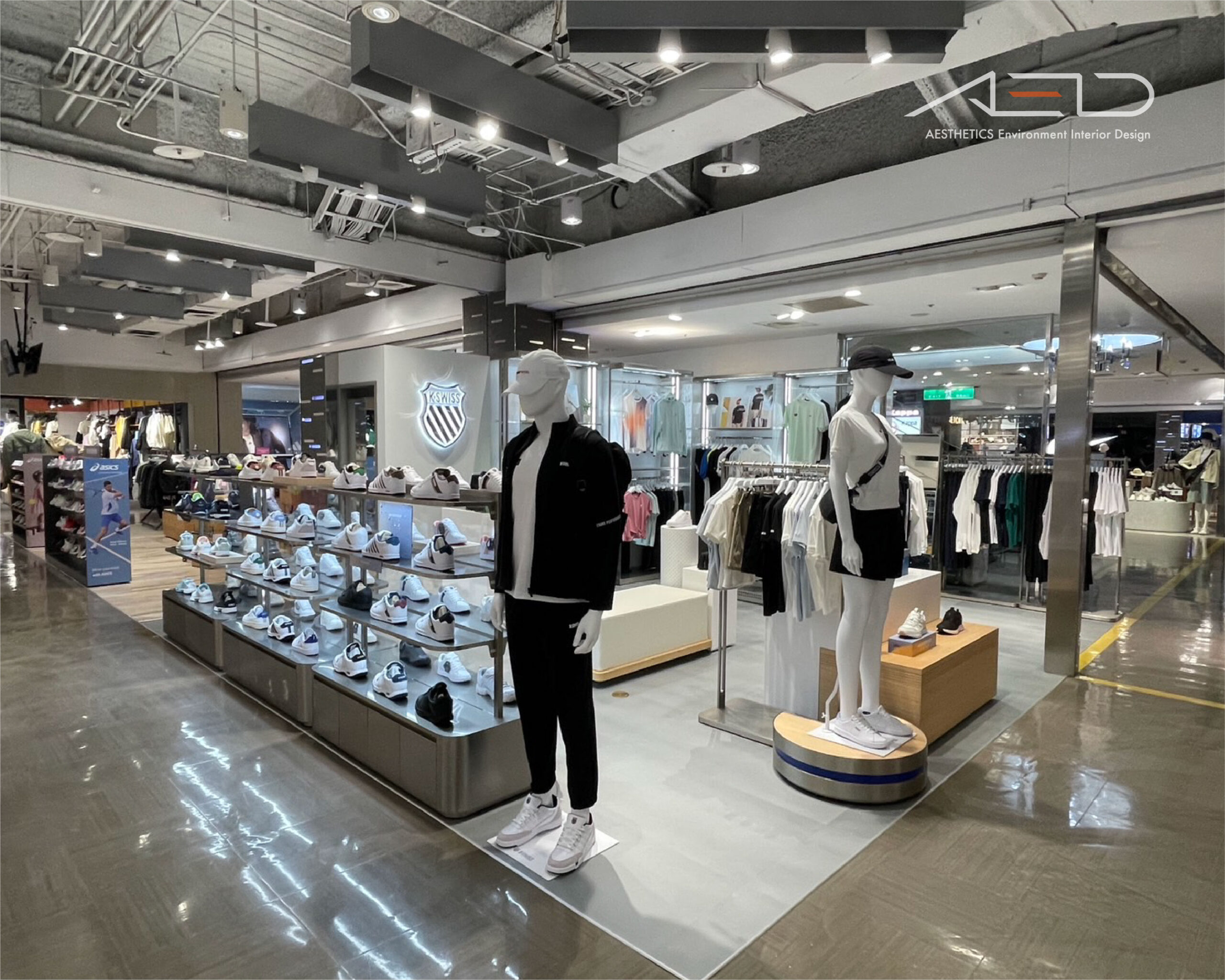
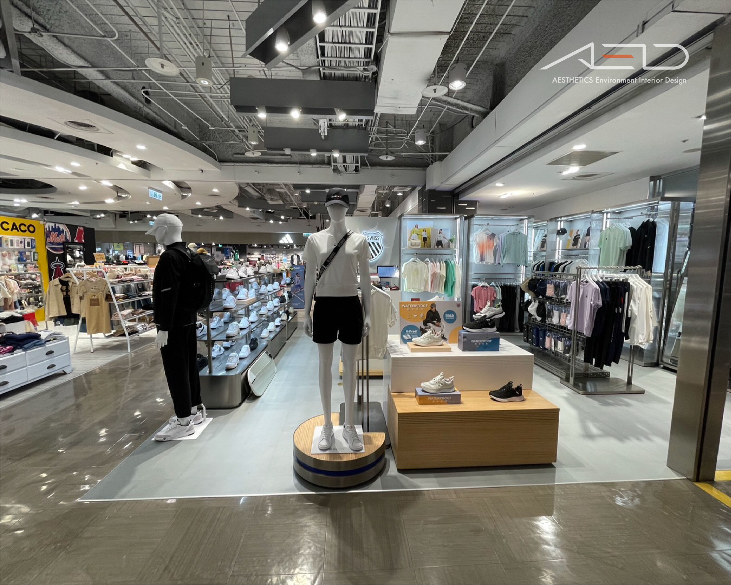
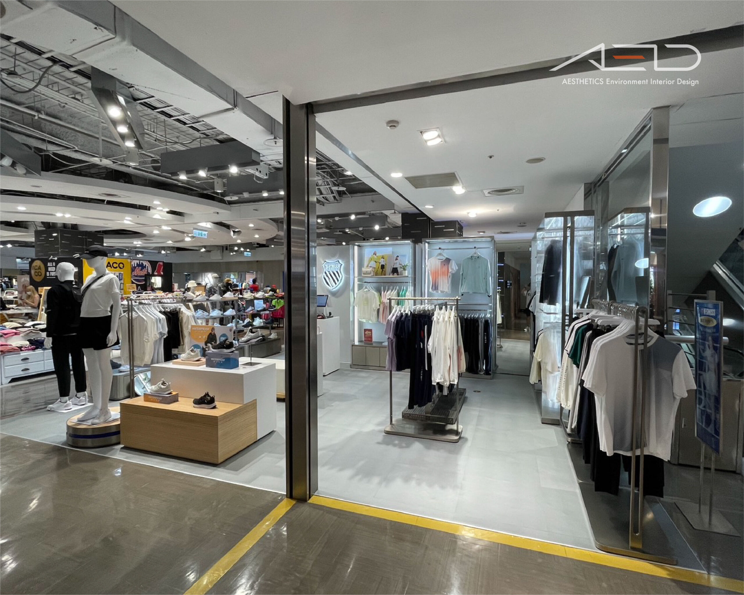
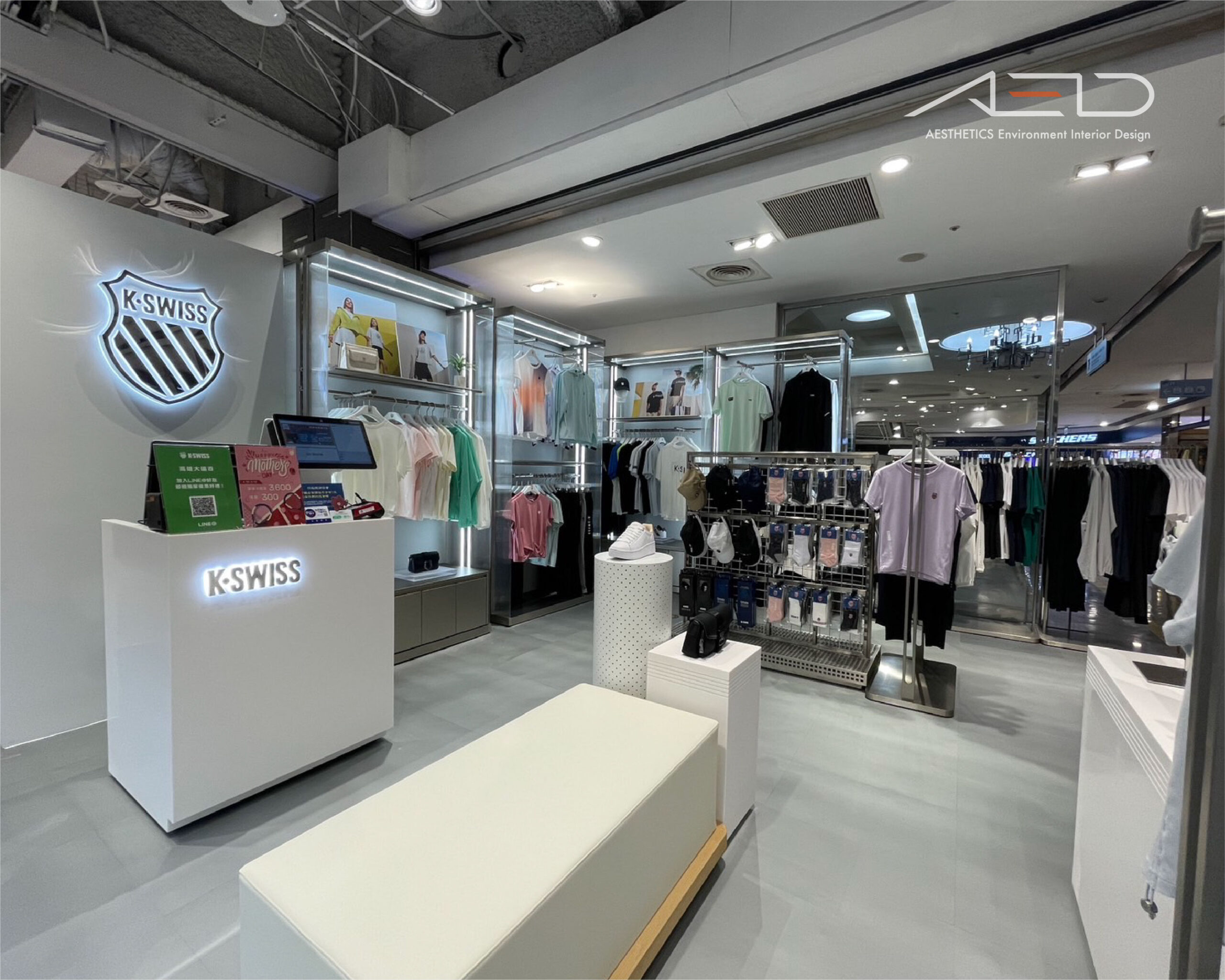
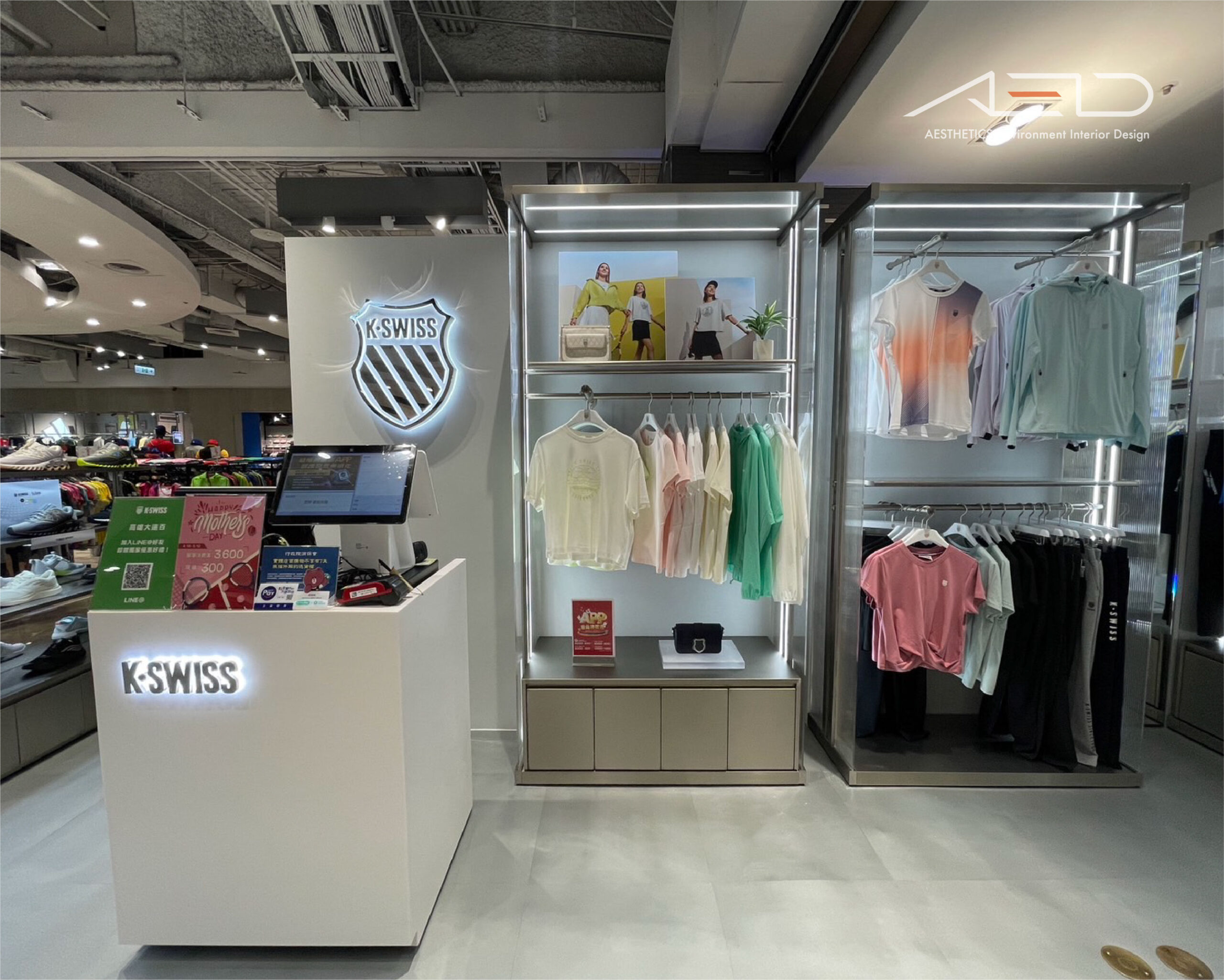
The entrance is defined by an illuminated stainless-steel brand logo, establishing a clear identity and creating a distinctive K-SWISS presence within the department store circulation.
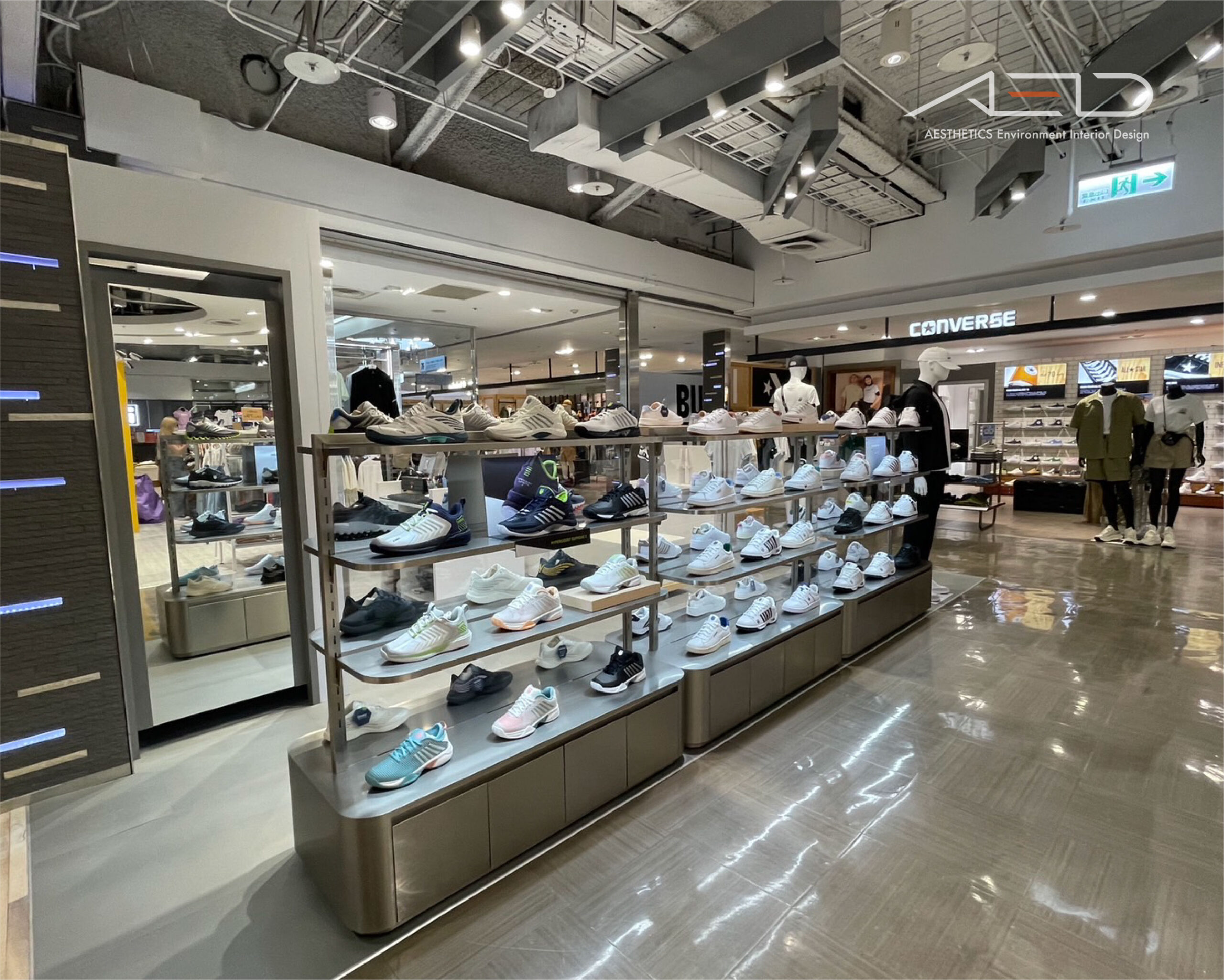
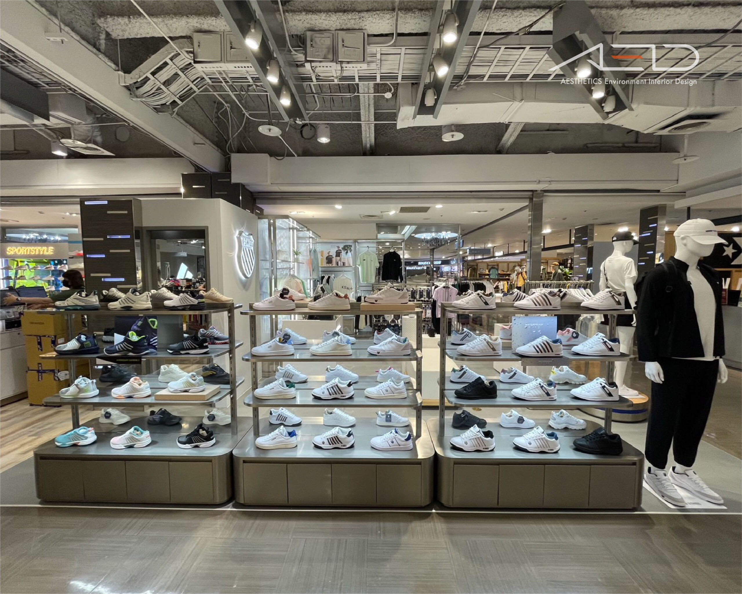
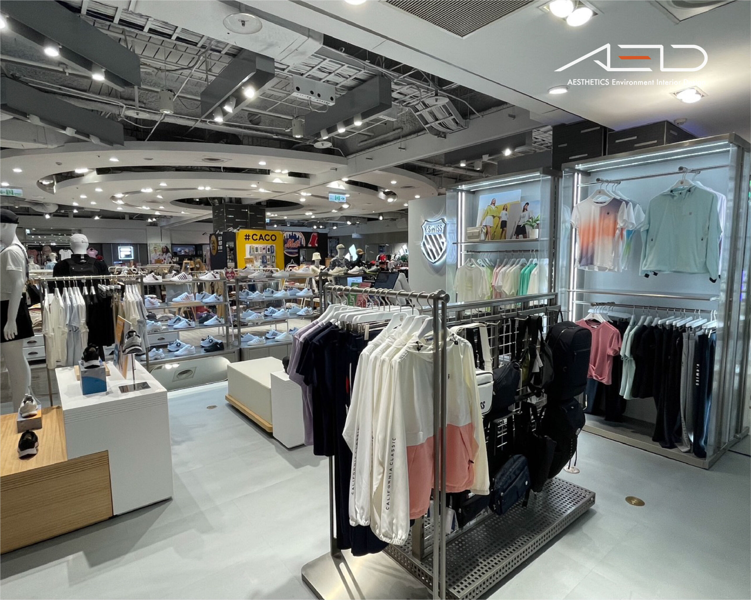
A central merchandising island organizes the main retail flow, while apparel racks and display shelving form the core presentation system, mannequins and branded display tables create a rhythmic sequence that highlights key products.
The cashier counter and in-store display elements act as spatial focal points, clean materials and integrated lighting define a sleek sports retail environment with an international aesthetic.